S
Analytics Dashboard
Performance data consolidation for org-level decision support.
Context
Namely prioritized to optimize performance platform and we launched the feedback hub as booster. Although the platform received strong engagement boost, it still hard to win back the market because of a long-lost piece—data.
Role
As leading designer, I focused on designing data viz experience to connect the dots. It helped manager/admin better understand their data and make better decisions to drive team/org performance.
Timeline
2024-2025
Team
PM, Dev, DS, Design
Skills
Product Design
Product Strategy
Stakeholder managementInteractive prototypingUser research & testing
-30%
Decision-making Time
+13%
Conversion Rate
+20%
Org Performance
Rethink Market Needs

Lack of data everywhere
Namely got stuck in a kind of limbo for a long time. The main reason was data, or rather, the lack of it. Even after feedback hub (see this case study) launched in 2023, we still collected bits and pieces of feedback and reviews, but didn’t connect them into a bigger picture. Managers couldn’t manage feedback activities across teams, and leaders couldn’t tell how feedback linked to performance results.
That’s a major problem for us in today’s market. Potential clients aren’t just looking for a place to do operations — they’re willing to invest in data-driven tools that tell a story.
Connect the dots
Set the tone for data viz
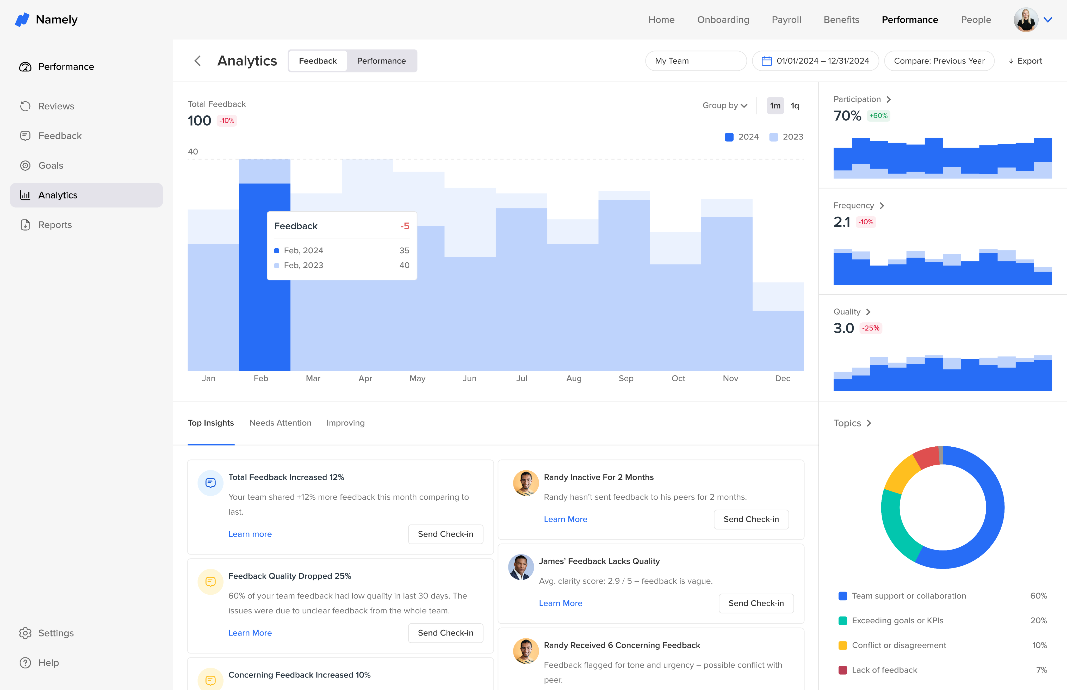
This project aimed to solve that problem by creating a consolidated page that surfaced the most important data visually. I was asked to lead the UX for it.
I decided to use analytics dashboard. I started talking to some HR teams, and managers and created an initial set of data viz cards based on the information I obtained about their workflow. These early explorations helped set the tone for the rest of the project.
As this was the first time a data viz card was being introduced officially, I had to create the design for the whole platform to ensure consistency for future data viz features.
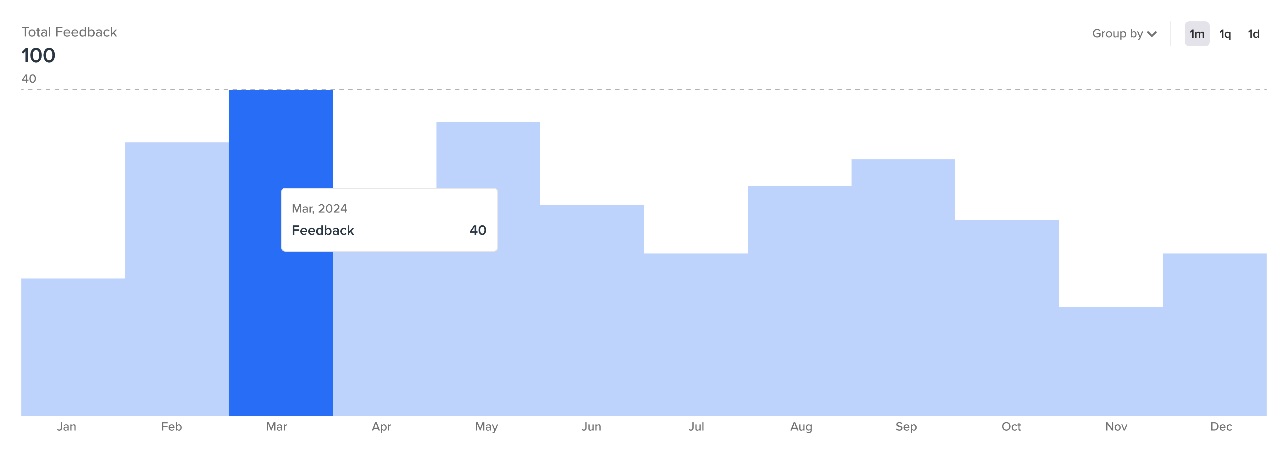
Version 1 - Exploratory


Make data easy to understand
Do minus
During the exploration, I did't feel my design settled down because I kept on iterating, but things weren't changing too much. So I decided to take a step back and thought about how can I reduce this? How can I make this more systematized and more organized?
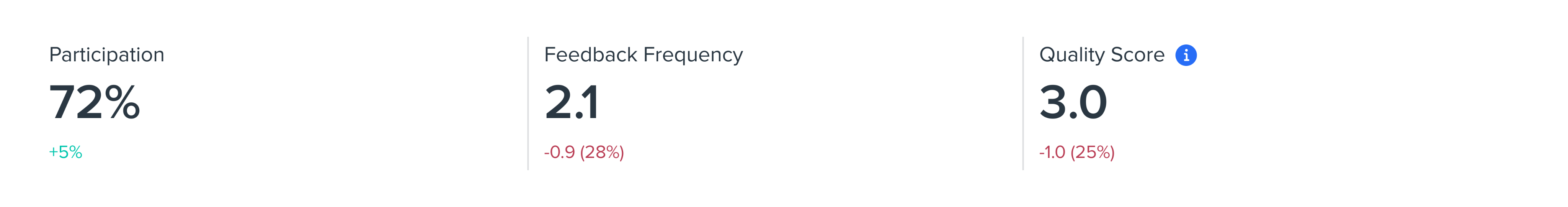
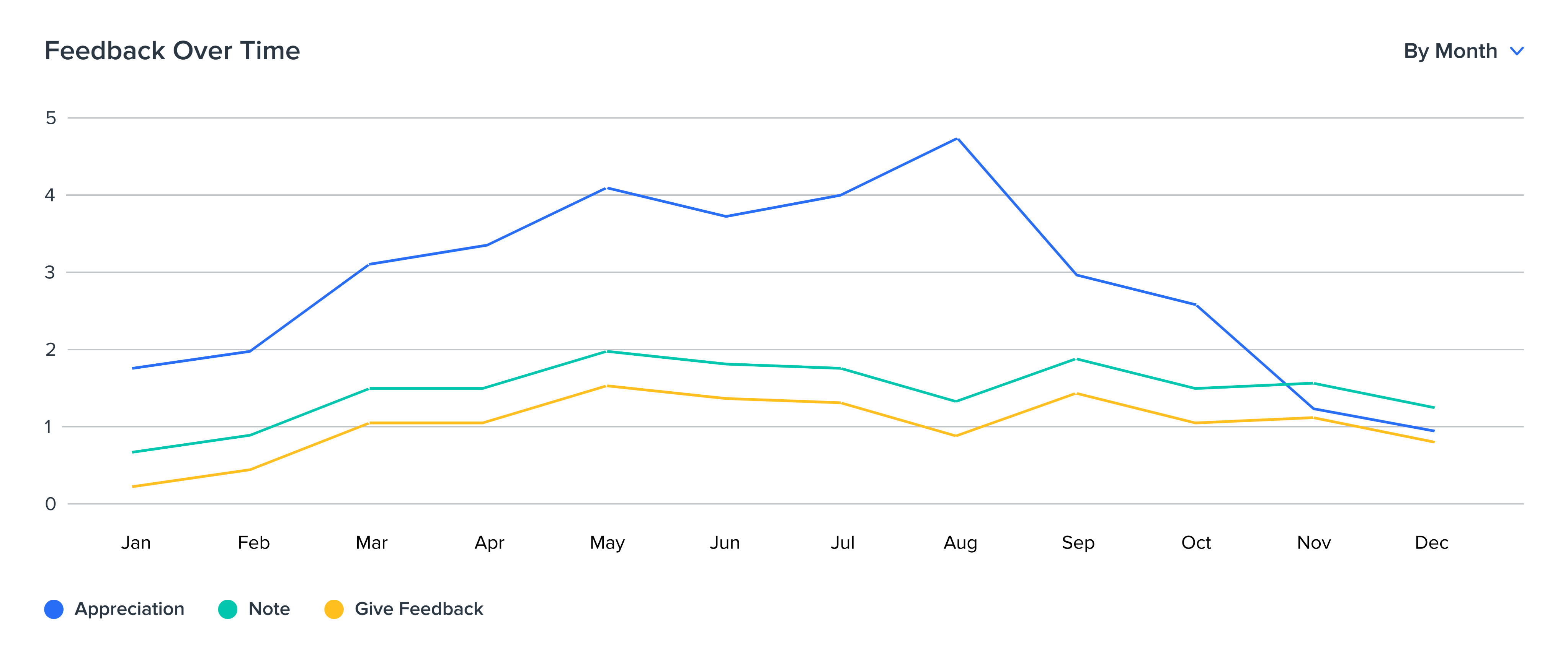
After aligning with the data team, I realized that total and topic metrics provided enough context. I simplified the data structure and shifted my design focus toward visual comparison, breakdown, and correlation to make insights more meaningful.
Version 2 - Revised
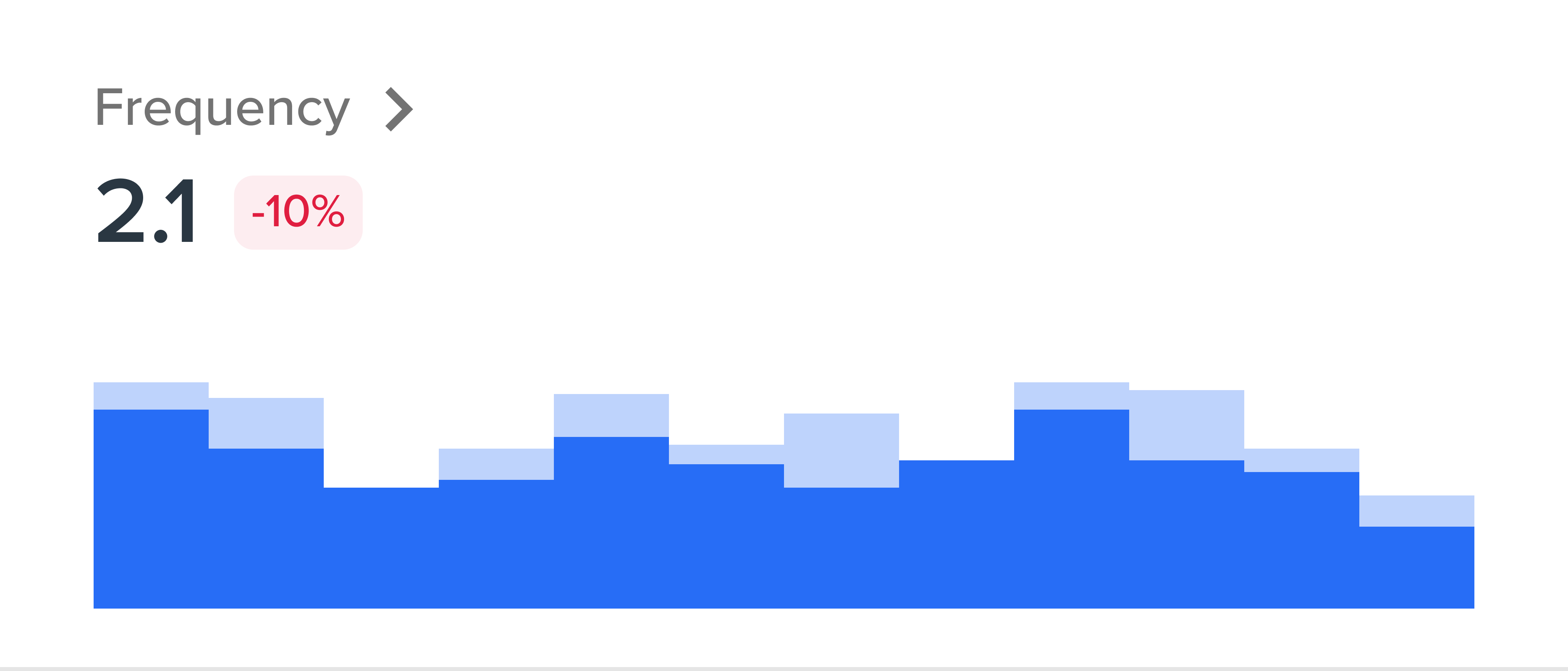
Times series
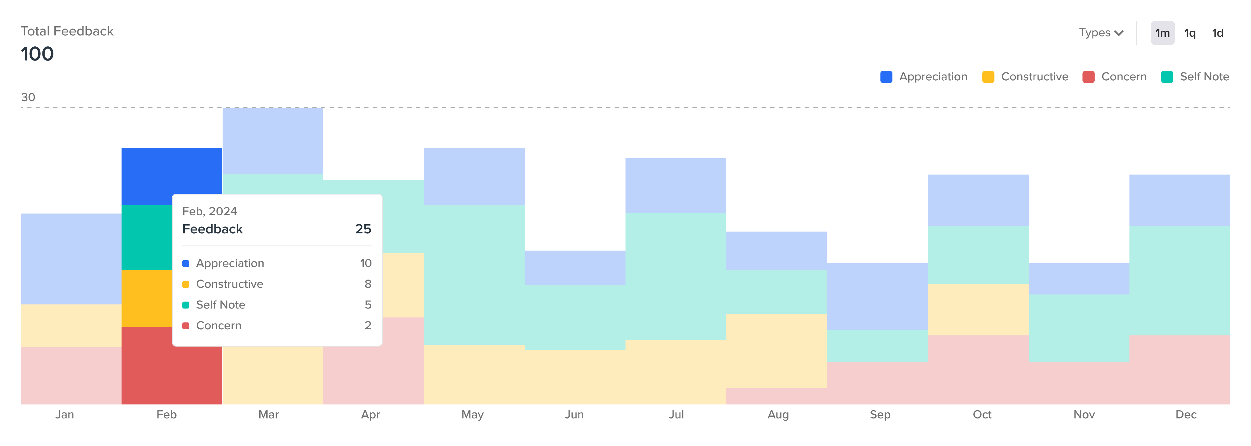
Break down time series by types

Compare by time
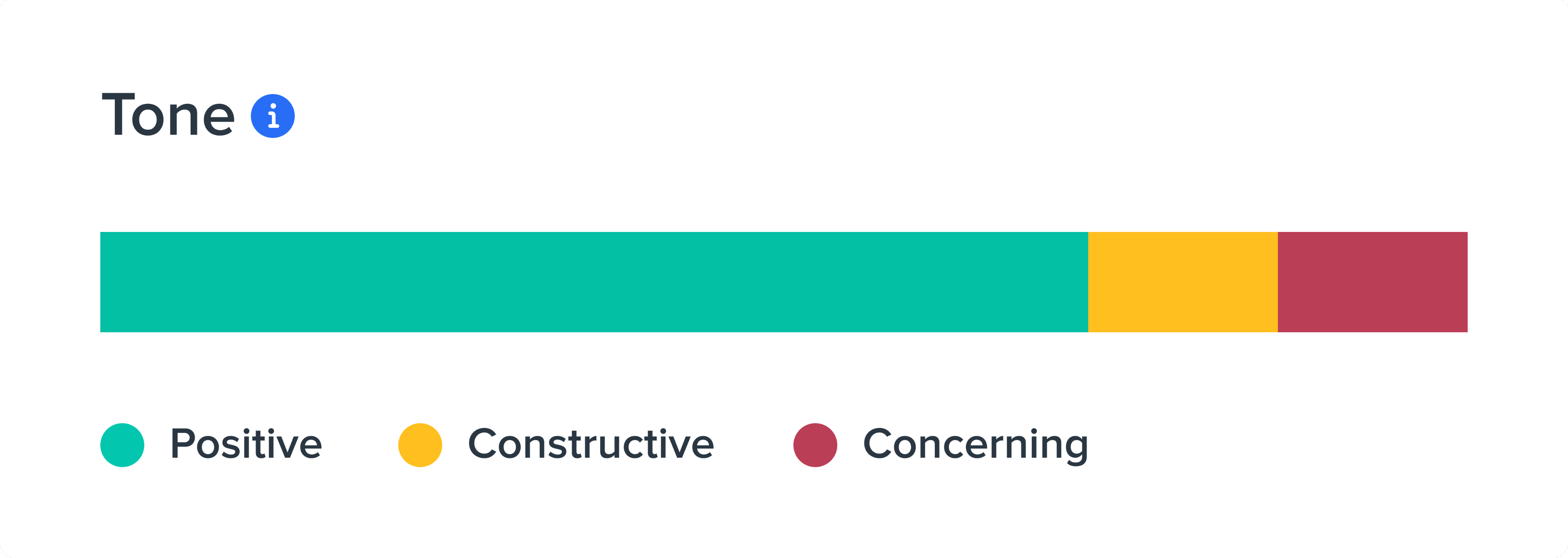
Overall activity breakdown
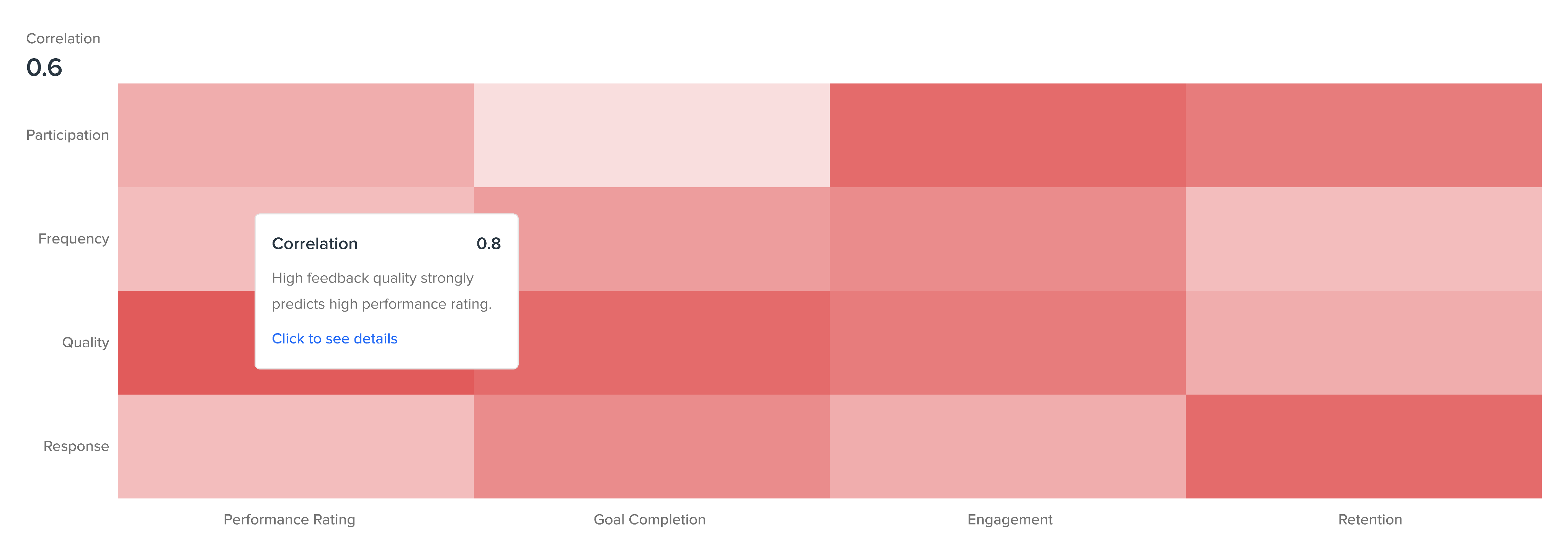
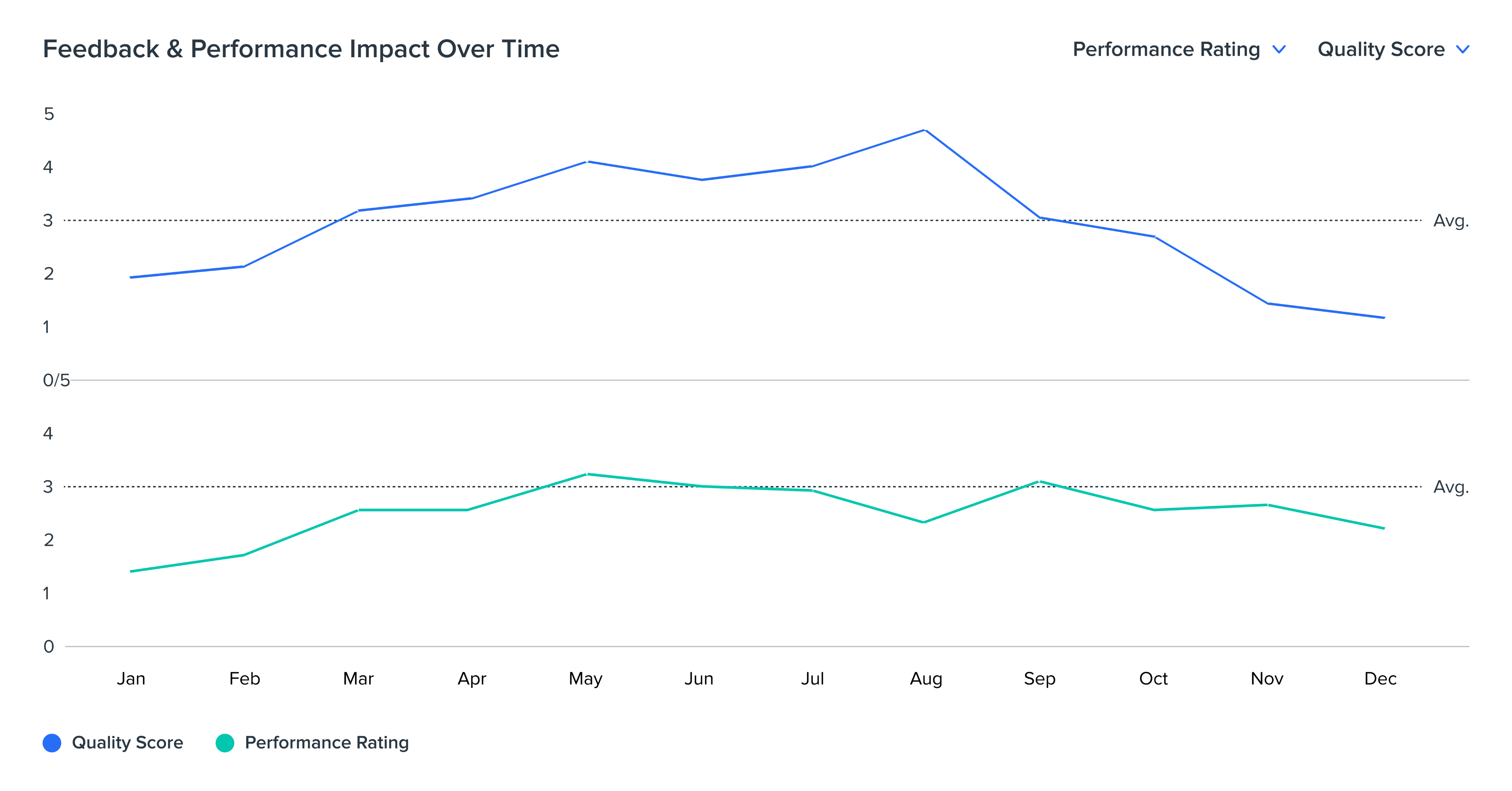
Overall correlation

1-on-1 correlation
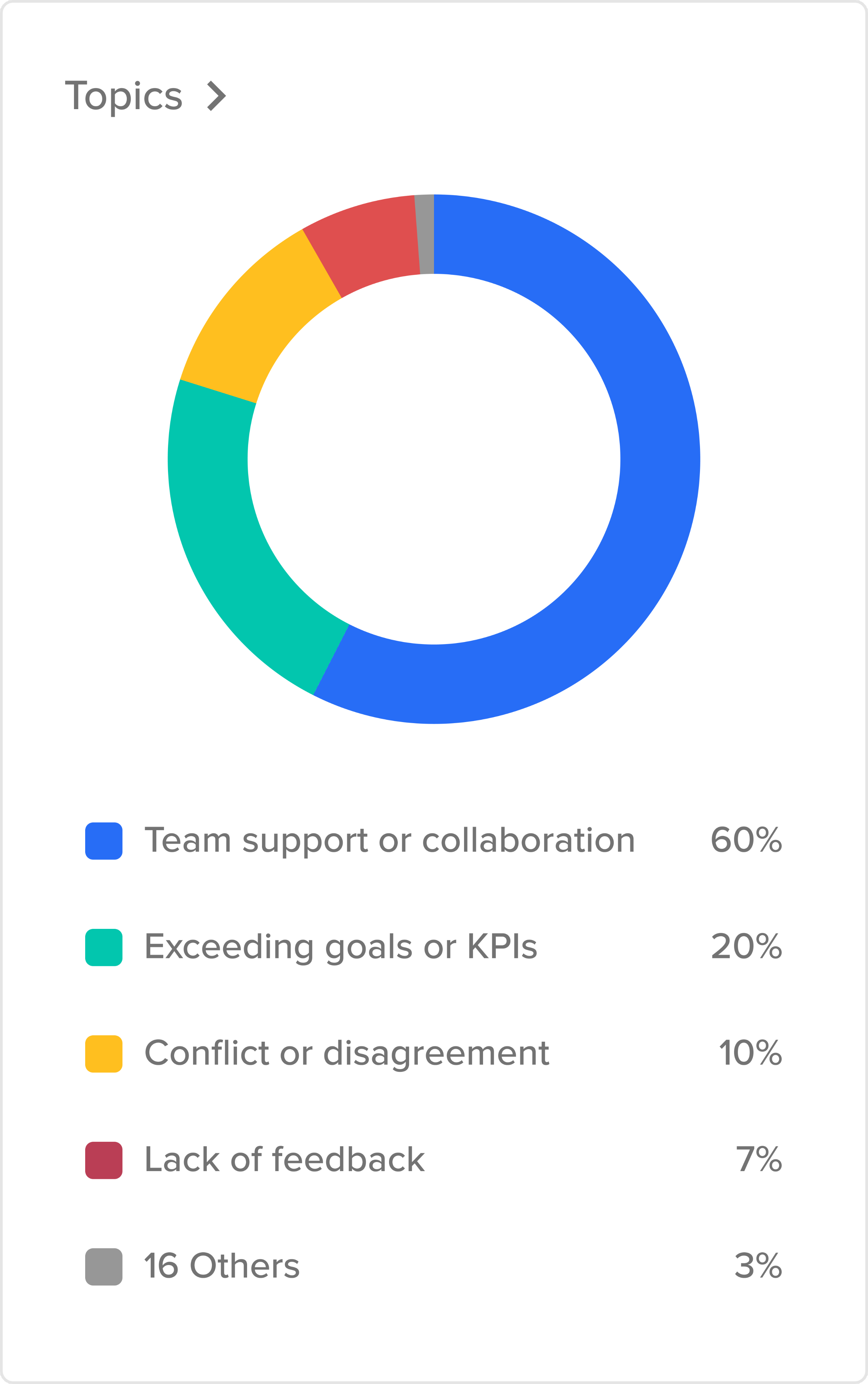
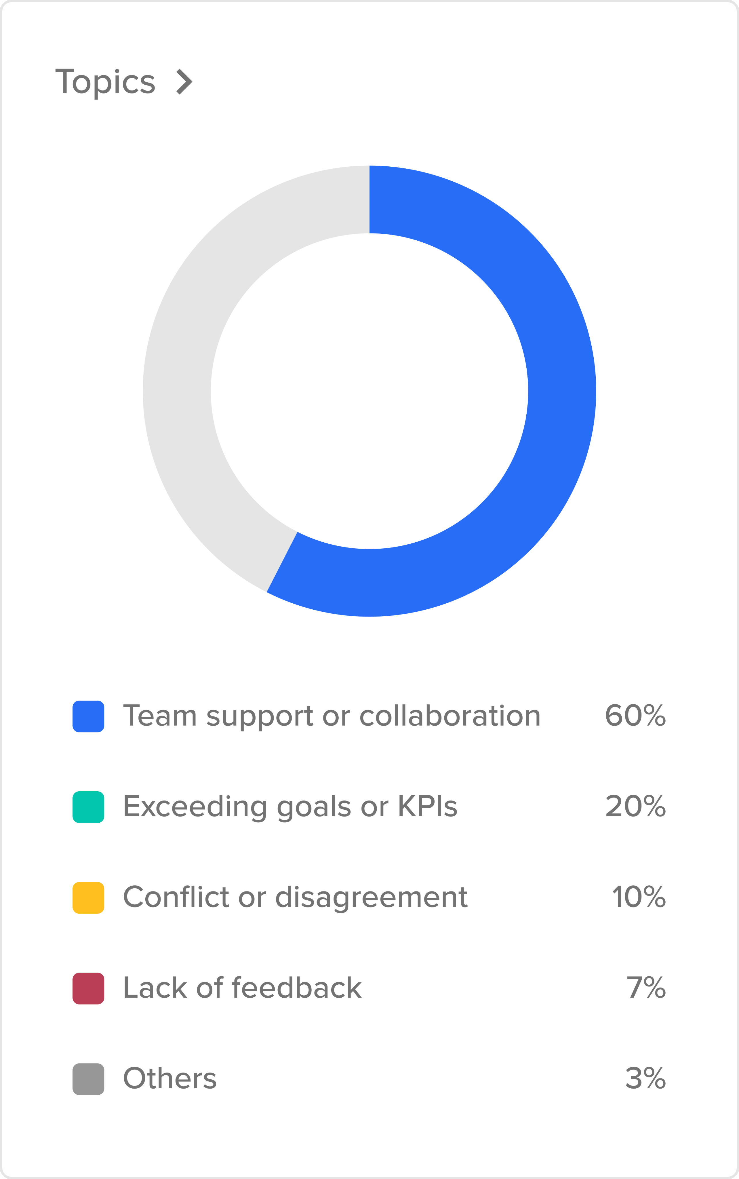
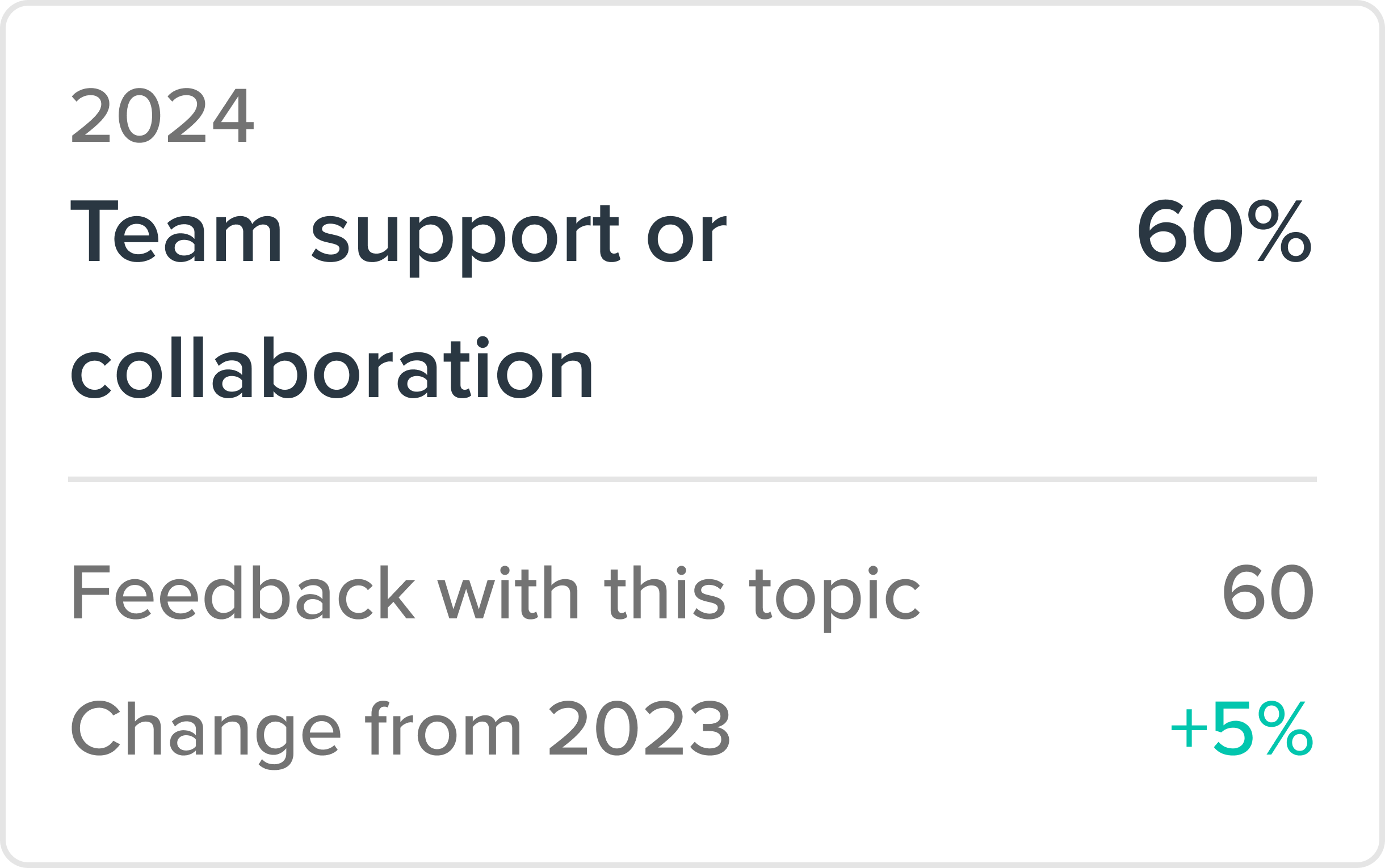
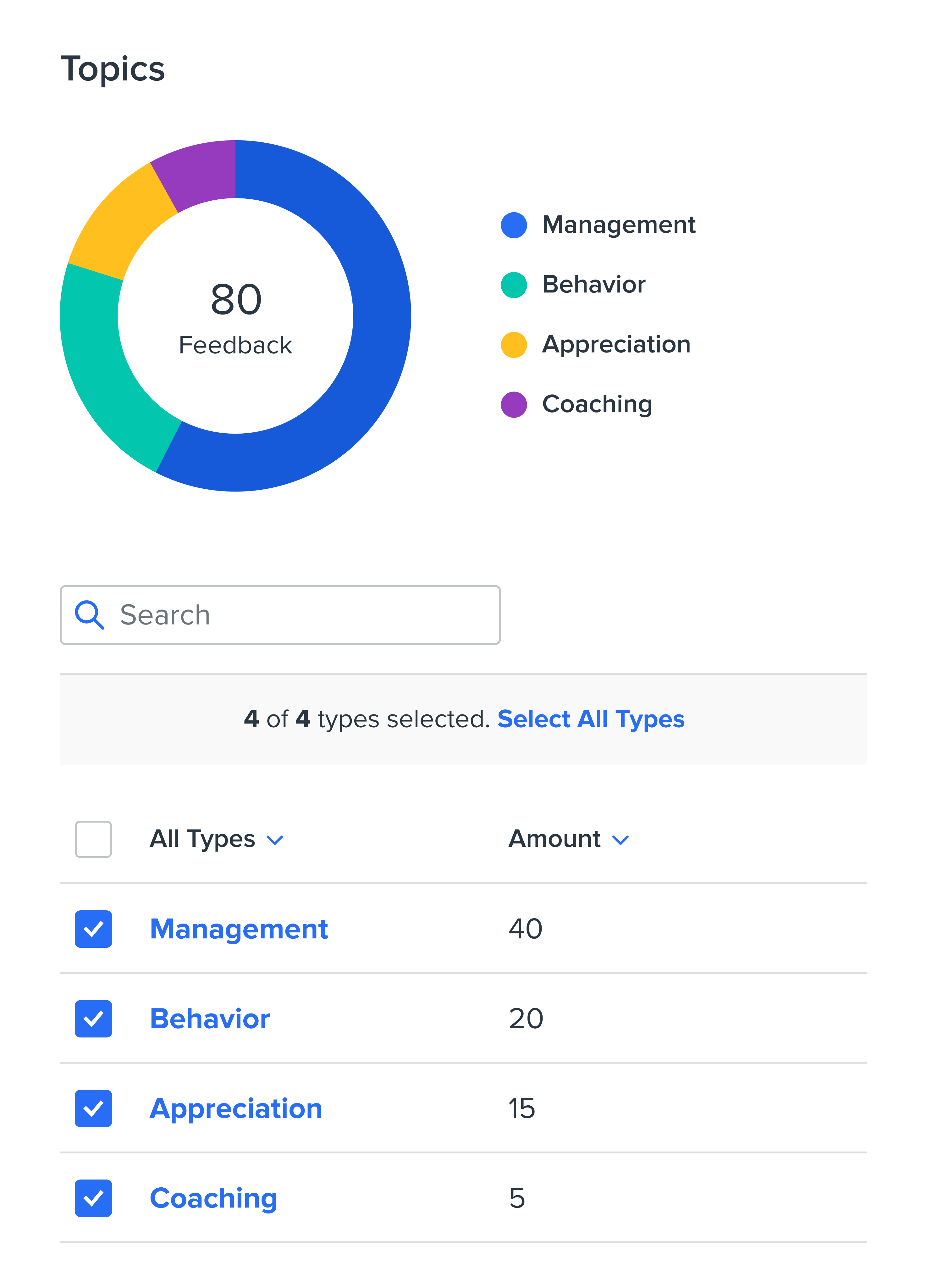
Topics
Help people make better decisions
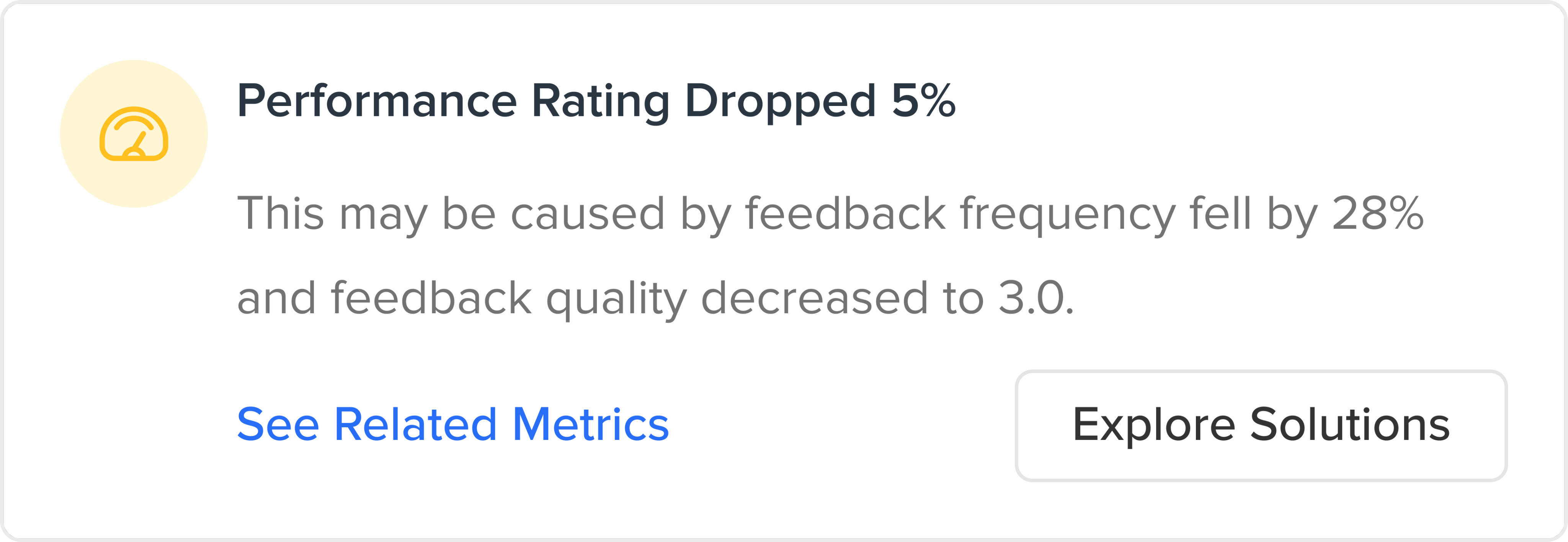
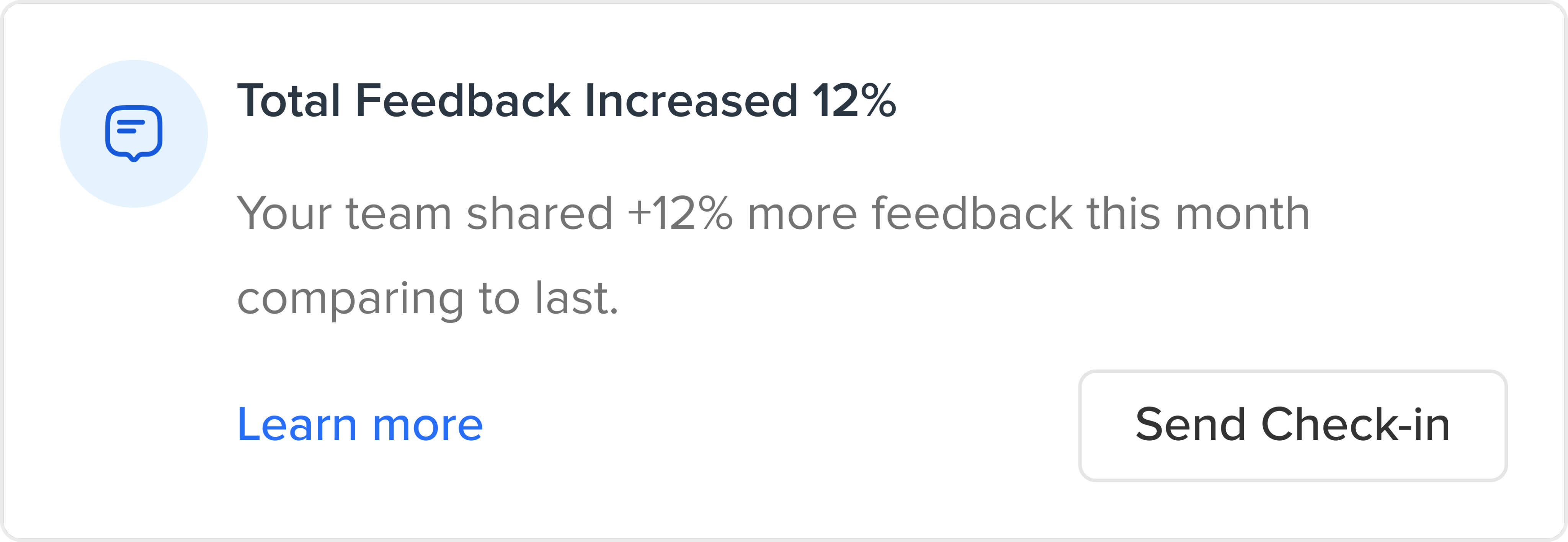
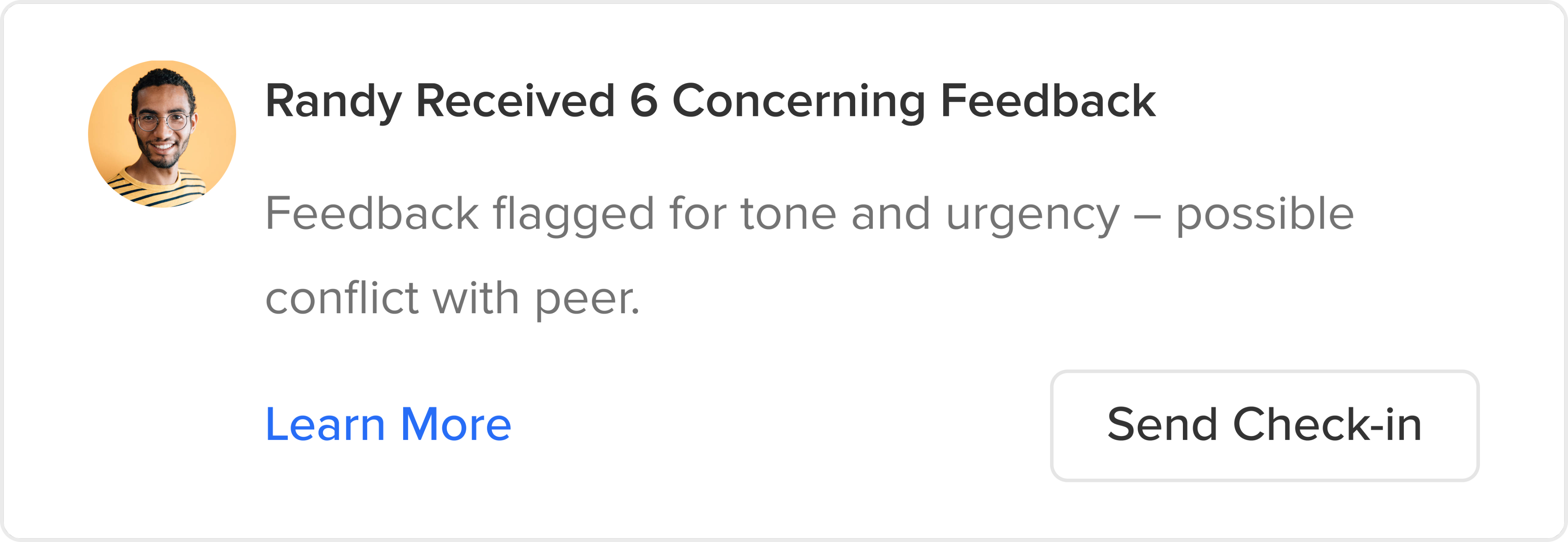
AI powered insights
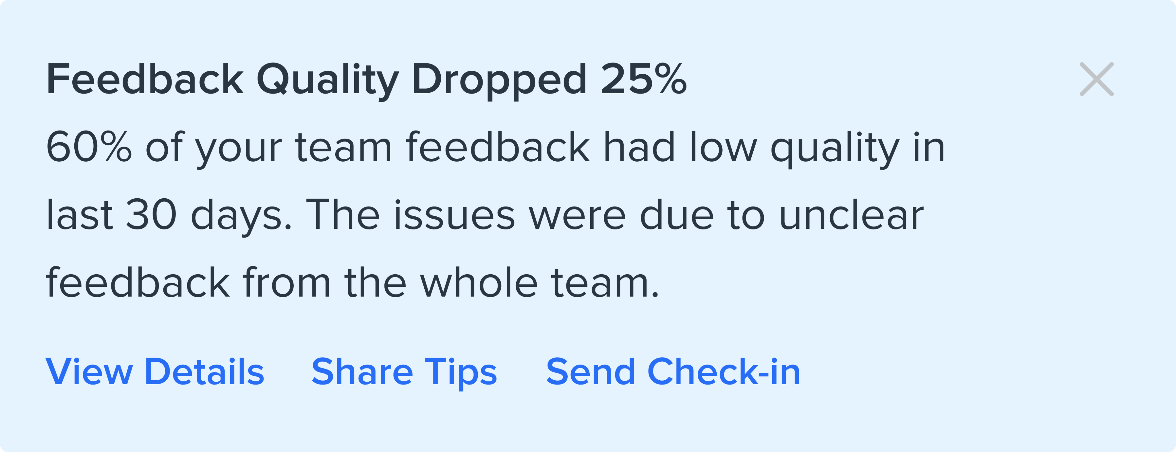
It took multiple rounds of user testing and many iterations for this project to evolve. From the test, I found out users still had difficulty to take action without enough insights. Along the way I worked with the data and engineering team, defining new advanced AI powered insights feature for them to implement. The new feature can correlate feedback with performance and generate recommendations or summaries.
Card view
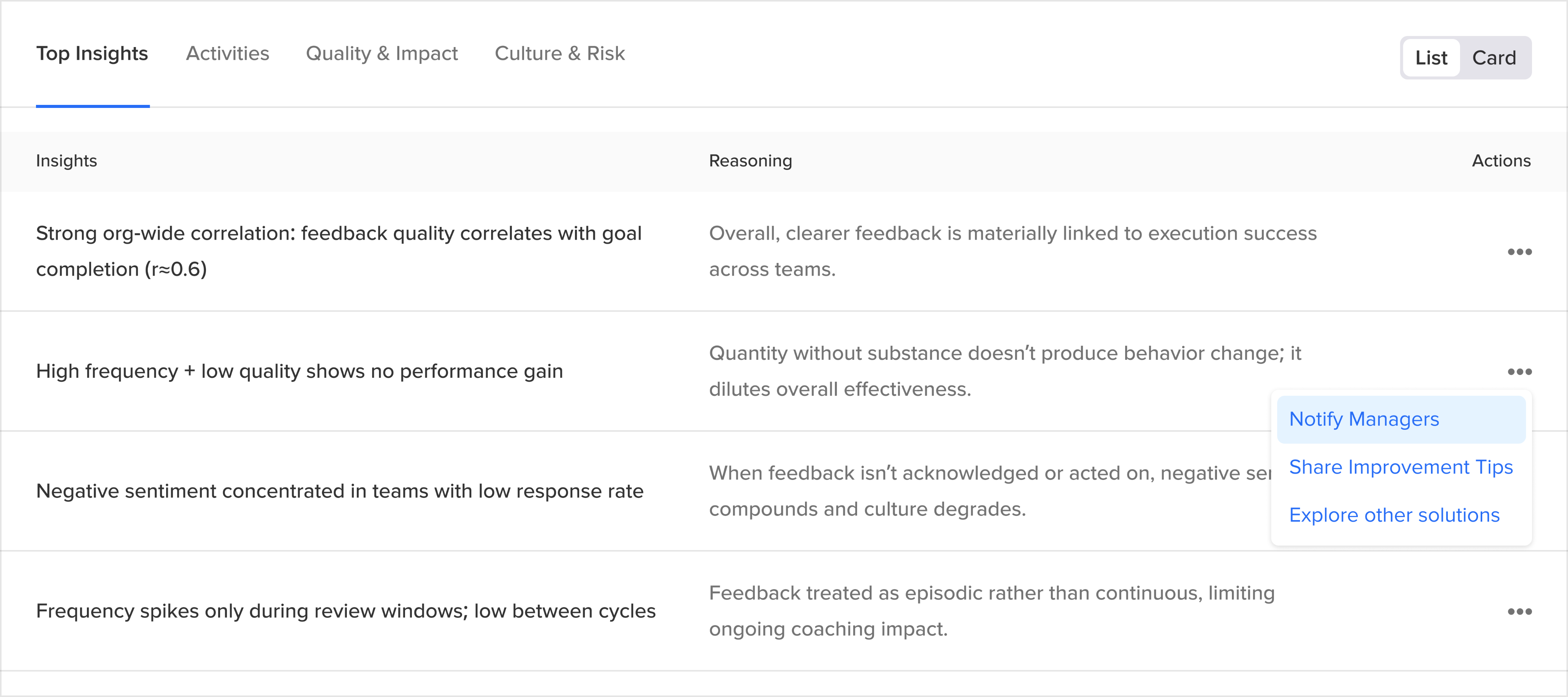
List view
Design for depth
Layered Structure
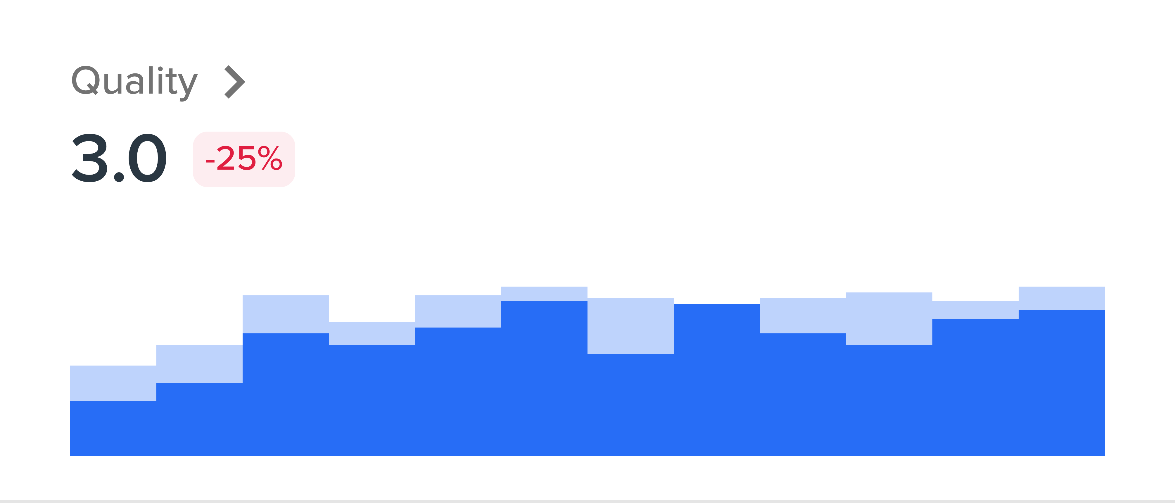
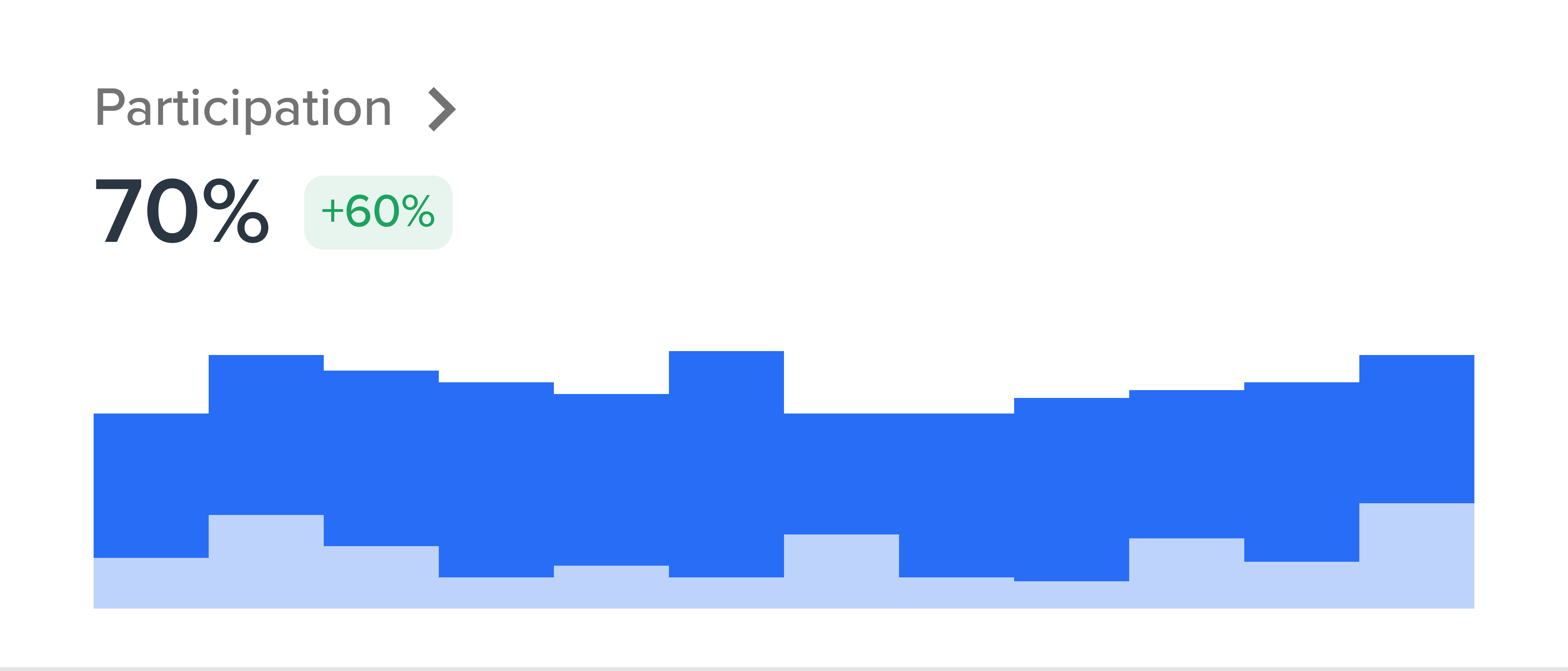
The final result was a simple, clean, and visually driven single-page analytics that showed only the most important insights and allowed manager/admin to dive in deeper if required. This also provided inspiration for data viz in in other parts of the platform, which has more in-depth data to explore.
Primary view: compare feedback trend by time
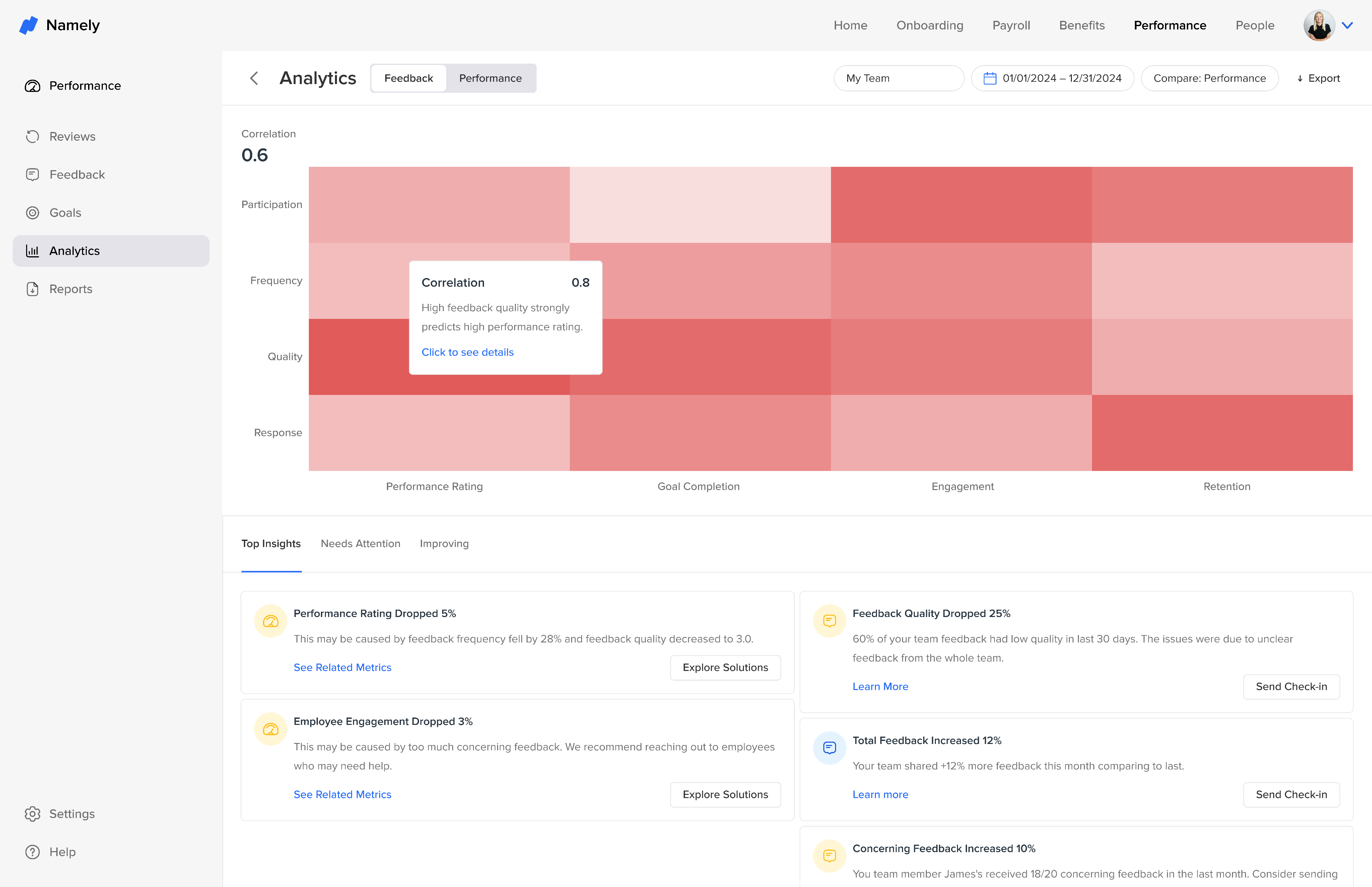
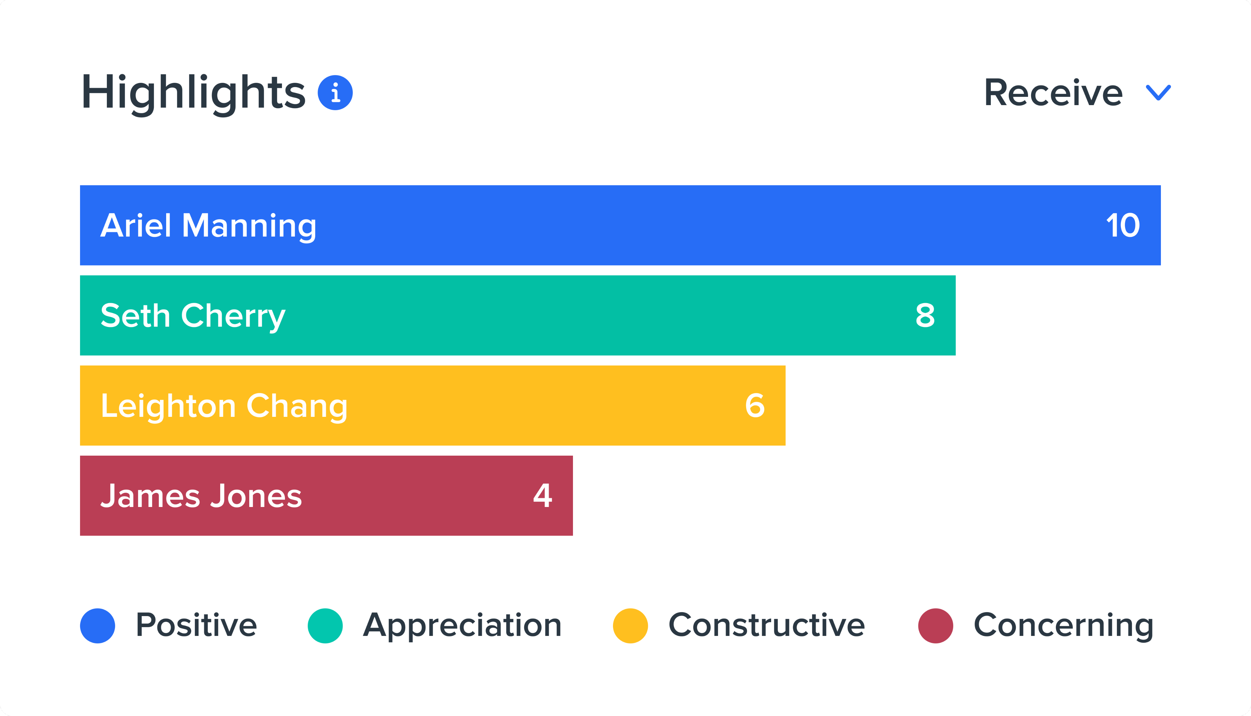
Primary view: overall correlation
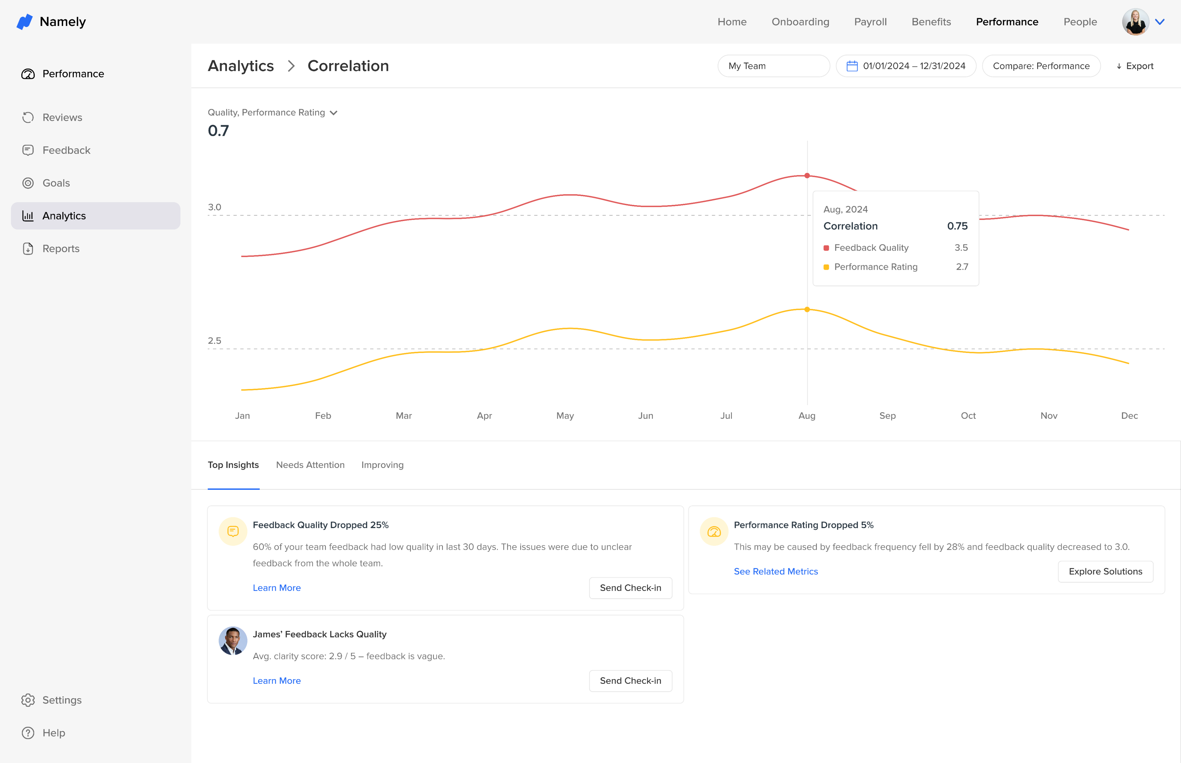
Secondary view: explore detailed one-on-one correlation.
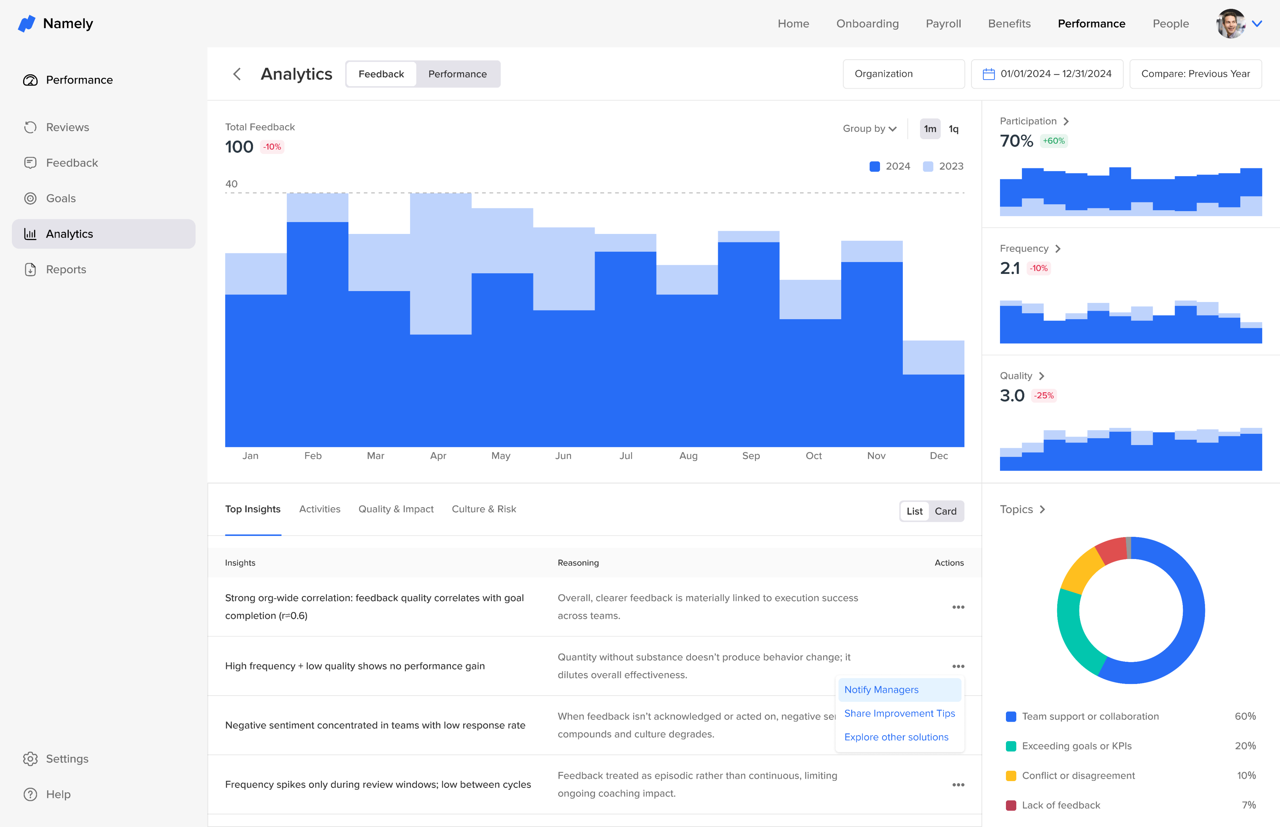
Admin view: check more complex org-level insights in one place.
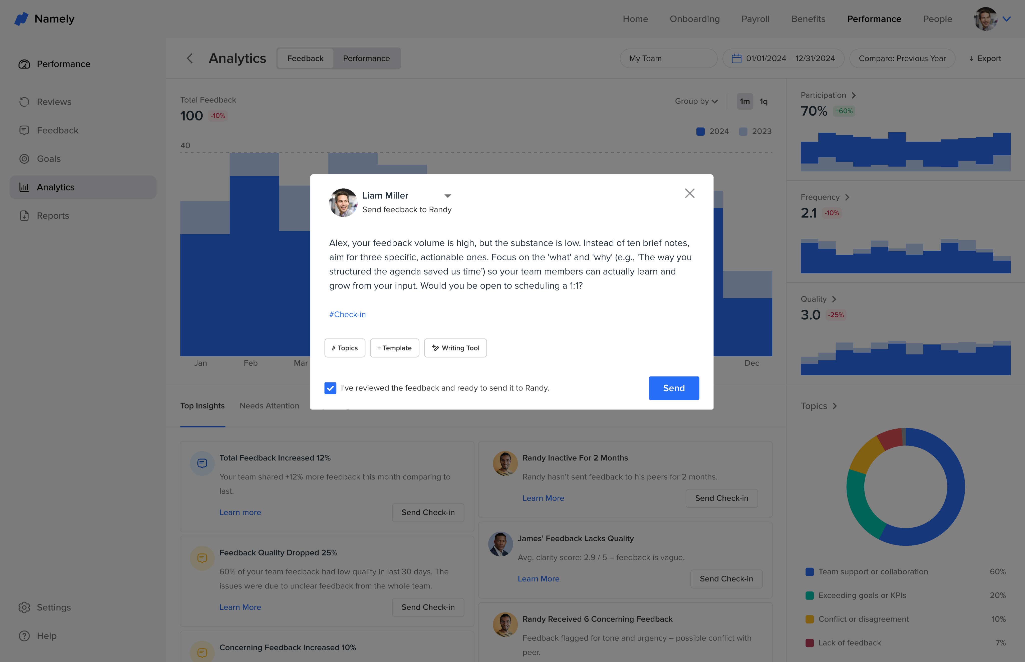
Cross-link: users can immediate actions, for example sending check-in message.
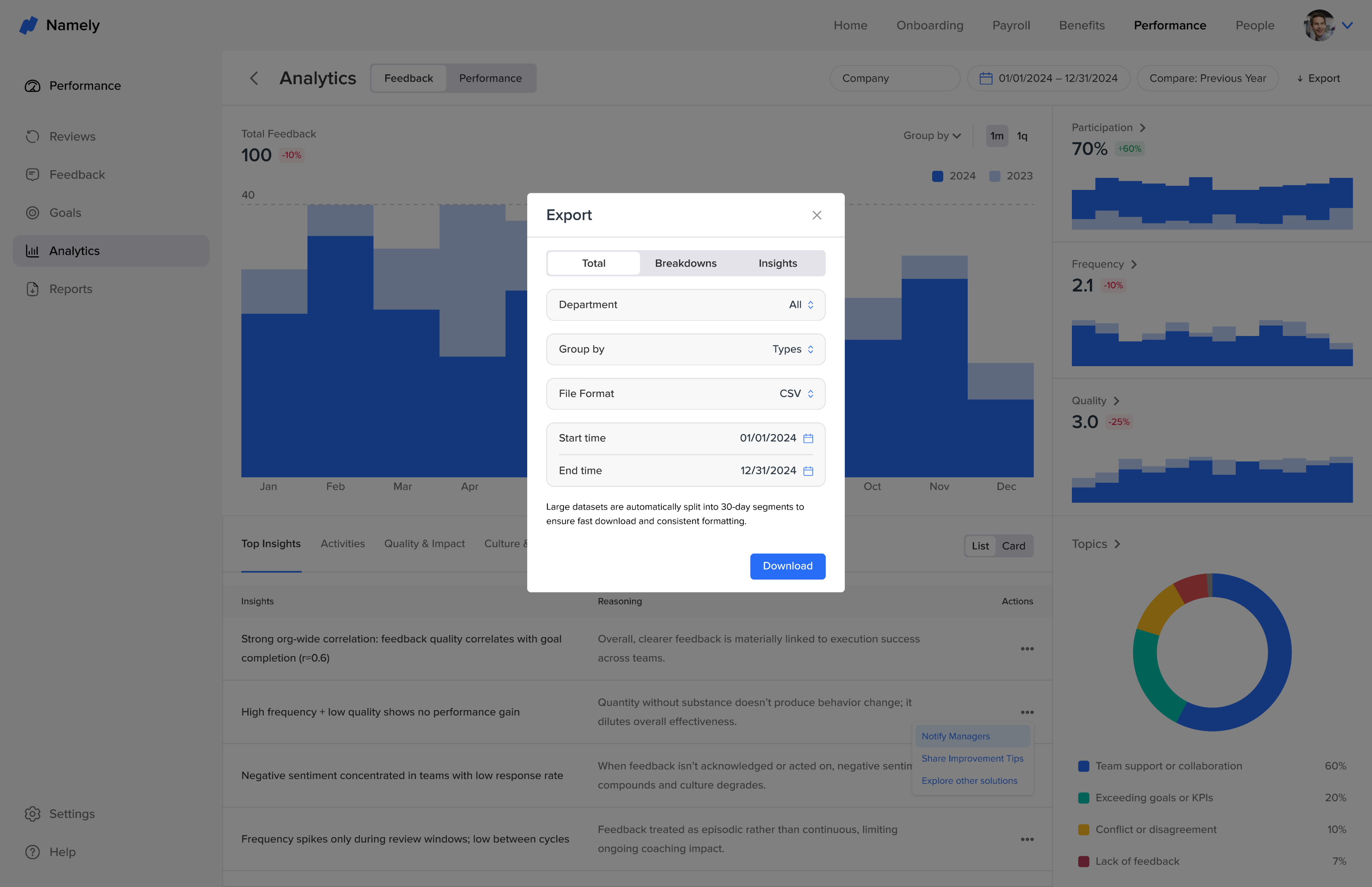
Cross-link: export customized report from analytics page.